Figuring out a design system for generative UI
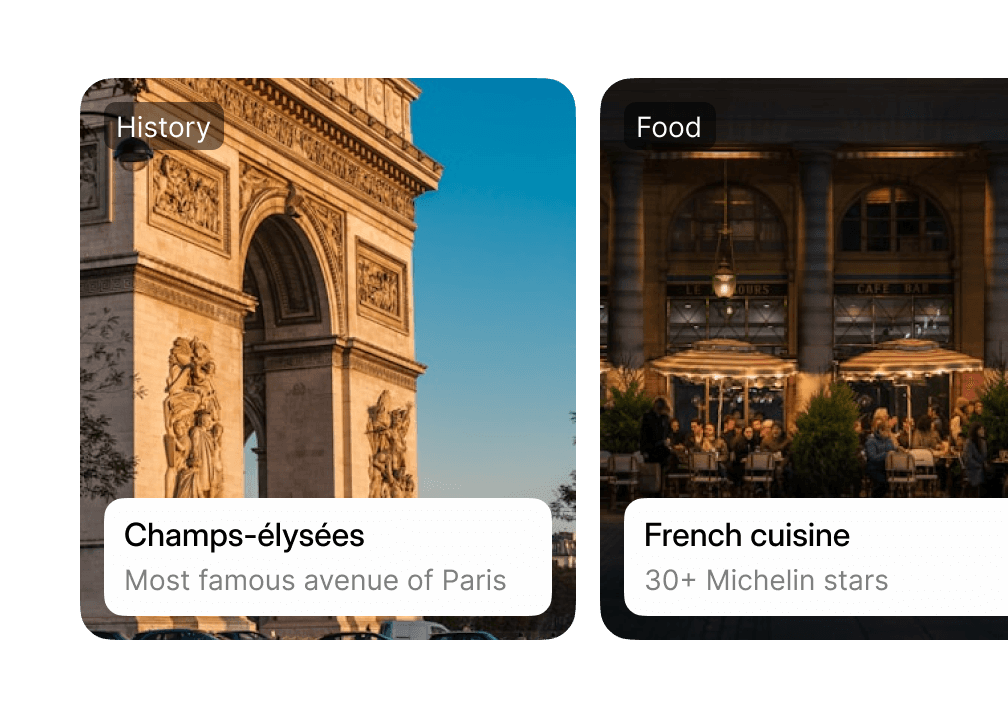
The idea of generative UI is that an interface adapts to the person and the task, instead of making everyone work through the same fixed screens. When we were starting, most AI-native interfaces were chatbots. That gave us a clear place to start: turning a text response into an interface.
Since then, we have kept building and rebuilding the system behind it, evolving it alongside the models.
- API Calls (3m)
- 173,359
Why another design system?
At first, this sounded like a familiar design system problem. We needed components that could show information and ask for input. The difference was that a model, not a designer, would decide what to use and how it should come together.

The models shaped this starting point too. At the time, Claude 3.5 Sonnet gave us the best results, but the range of interfaces it could put together reliably was still narrow. Our first steps focused on what the model could do consistently, and the system expanded as those capabilities improved.
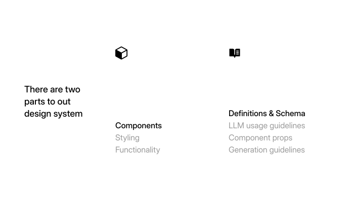
Built to morph
To make that possible, we needed a strong primitive base first. The structure and behavior of each component had to stay consistent, while things like color, typography, spacing, radius and shadow could change around it. That way, the same button could feel at home in very different product systems without being rebuilt each time.
June 2025: the starting point
The first version of the system was deliberately small. We began with a basic set of components that covered the most common things an agent might need to show or ask for inside a conversation.
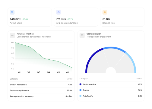
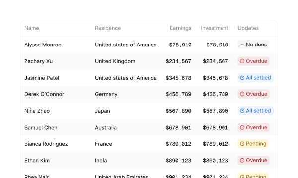
There were familiar form elements: input fields, radio buttons, checkboxes and select fields, along with buttons and tags. For data, we had tables and the basic charts: bar, scatter, line, area, pie and donut. Alongside them was a small set of markdown elements for the simpler moments when text and structure were enough.
We were trying to understand how much it could do with a small, legible set of parts.
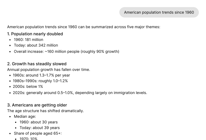
Even with a basic set of components, we could see a pretty decent upgrade.
Adding compound blocks
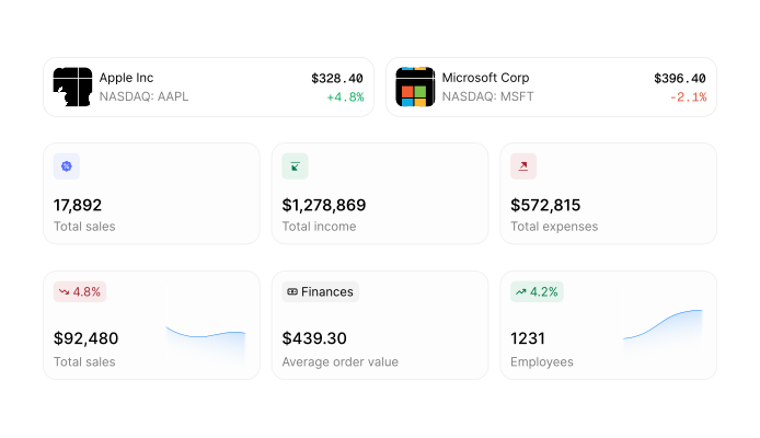
By August 2025, we were beginning to move beyond individual primitives. We added a compound block called mini-cards, giving the model a more composed pattern instead of asking it to assemble every part on its own.
The idea made sense to us. We had a card with two slots: left and right, with the right slot being optional. We also had pairing logic, so given a specific part on the left, only a certain set of parts could fit on the right.
It didn't work as well as we hoped though.
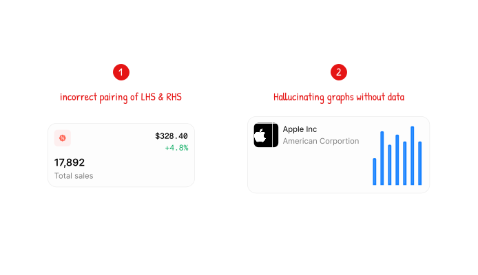
- Models at the time struggled significantly with “don't use this…” constraints, which led to incorrect left- and right-hand-side pairings.
- Optional elements, especially graphs, significantly increased hallucinations—including graphs generated without supporting data.
Compound blocks, rebuilt
The first system combined general components with components made for specific use cases. Mini-cards, for example, were meant for information you could understand at a glance. But because they were one of the few patterns we called out explicitly, the model started reaching for them far more often than it should.
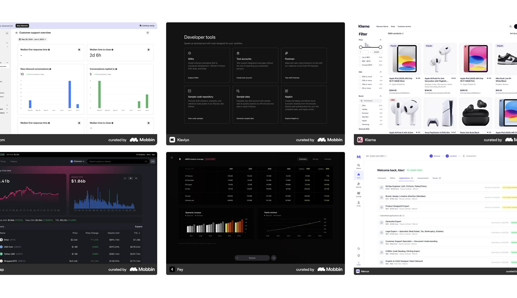
Before rebuilding it, we went back to first principles and studied common web and mobile interfaces across popular products. Across categories, we kept finding the same structural patterns: information was organised into familiar groups, sections and hierarchies. Most interfaces were structurally very similar, with a handful of specialised accents layered in where the product demanded them.
What changed dramatically was the stylistic expression. Type, colour, density, imagery, shape and motion gave each product its own character. That separation became the foundation for teaching the model: give it a granular framework for structure and composition, pair that framework with a smaller set of accent components, and layer each product's brand on top.
The rebuilt system was much more flexible:
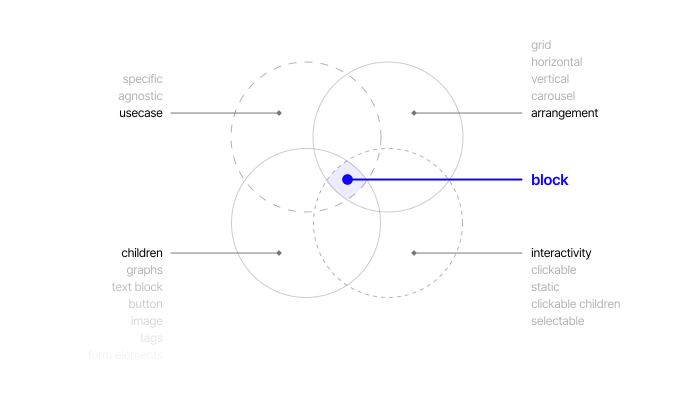
- Regular blocks and compound blocks that could contain multiple blocks within them gave the model structure without locking it into a single use-case template.
- General-purpose composable cards meant the model no longer had to force content into cards designed for specific cases.
- Interactivity and arrangement layers gave the model clearer ways to decide how parts behaved and came together.
These changes made the generations exponentially richer and much more robust.
Extending the system to static and live artifacts
This felt like the most natural extension of the workflow. You would talk with an agent, arrive at useful insights, and then want to turn them into something you could share or keep using. As the component language grew, we could support that next step by extending it beyond conversational responses into two kinds of artifacts:
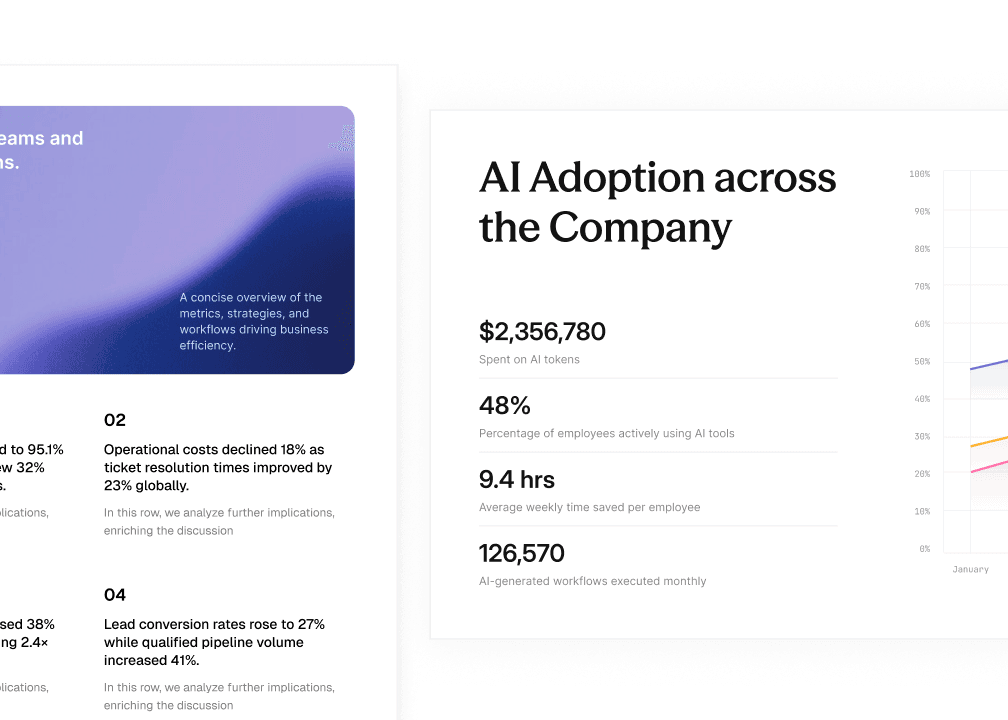
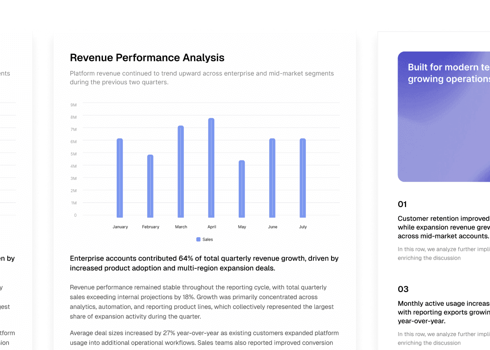
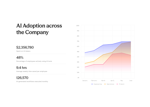
- Static artifacts were structured, document-style outputs such as presentations and reports. They could be generated from a prompt and data, streamed as they were created, and edited iteratively.
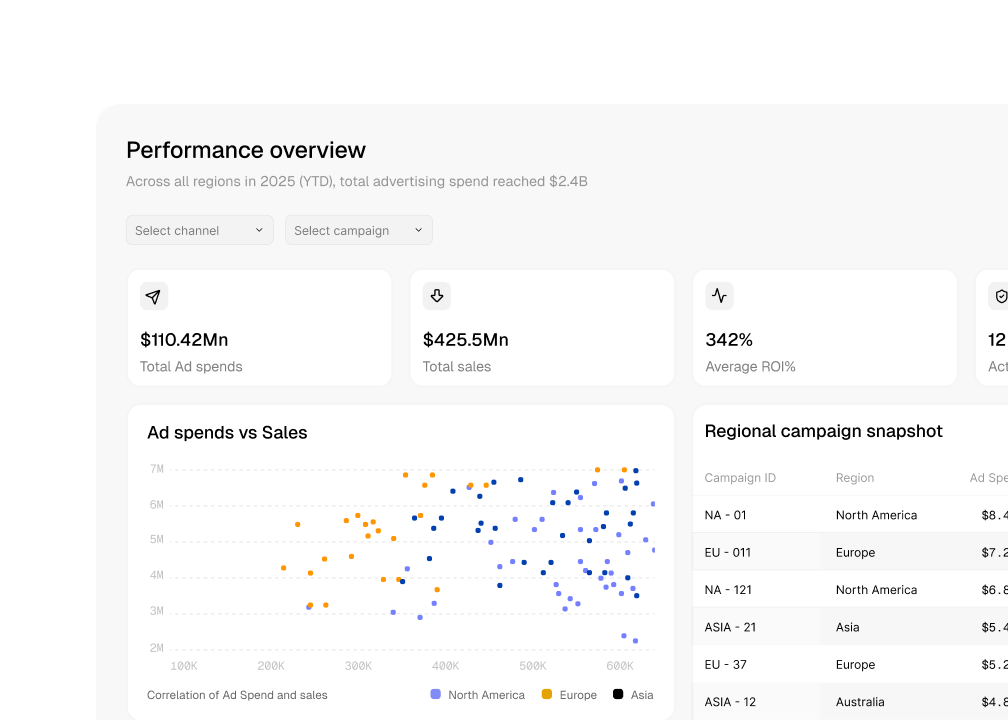
- Live artifacts were dashboards built for ongoing interaction and changing data, using the same system to compose interfaces that could remain useful beyond a single response.
Explaining composability
Once the system became modular, another problem appeared: we had to help other people understand what could be composed, what should remain constrained, and how much control they still had over the result.
We began explaining each block through its purpose rather than only its appearance. People could explore its configurations, see how those choices changed the instruction given to the model, and guide composition through prompts and usage rules. The system could remain generative without becoming a black box.
Visual expression was separated from structure as well. Colours, typography, spacing, radius and shadows could be changed through theme tokens without asking the model to relearn the component language. Users could shape how the interface looked while the underlying blocks continued to mean the same thing.